the brief
the visual language
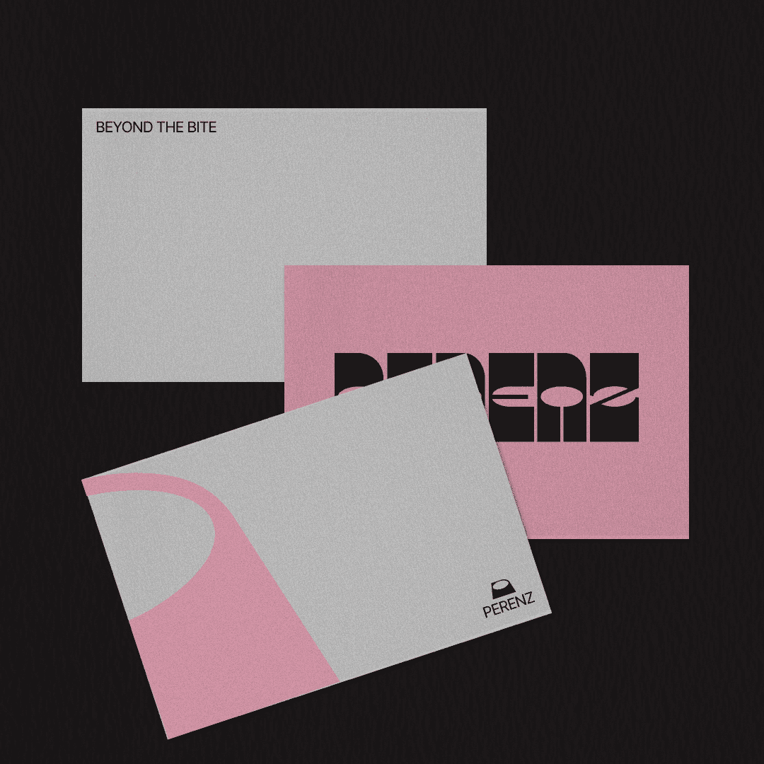
The identity and spatial visual system reflect the fluid, malleable qualities of jelly, translucent, jiggly, and adaptable. High-contrast typography pairs heavy, block-like display letterforms featuring spherical, void-like counters with a warm color palette of muted rose, dusty sage, deep crimson, and warm cream. Translucent glass panels, ribbed surfaces, and organic, curved cutouts mimic the shimmer and wobble of gelling matter under filtered light.
the decisions
To mirror the transformation of matter in molecular gastronomy (liquid becoming solid, transparency gaining texture), the retail space was structured into three distinct zones: Display + Retail (snacks, tools, memberships), Seating (tactile sensory dining), and Learn (personalized culinary understanding). Architectural features like layered glass, ribbed translucent cubes, and fluid cutouts were designed to make visitors feel suspended inside a living, changing sculpture.


move the notes around to see ideation sketches!


form derivation


experiences
A space is an experience. Multifaceted, all encompassing, and unique to each who enters it. To design and conceptualise a space from a word prompt, broke all boundaries of what I was used to. Bigger, grander, dreamier! A space , built not of brick and mortar, but of hopes and aspirations. Beyond the limitation of a budget, beyond realistic timelines, SWOT analyses or consumer studies, this project provided and opportunity to let the mind have fun
